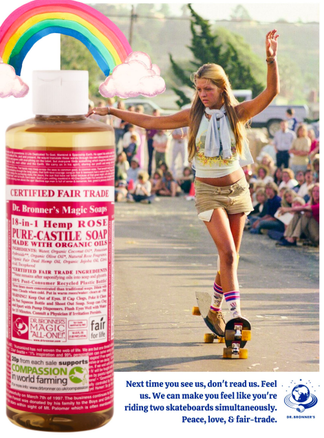
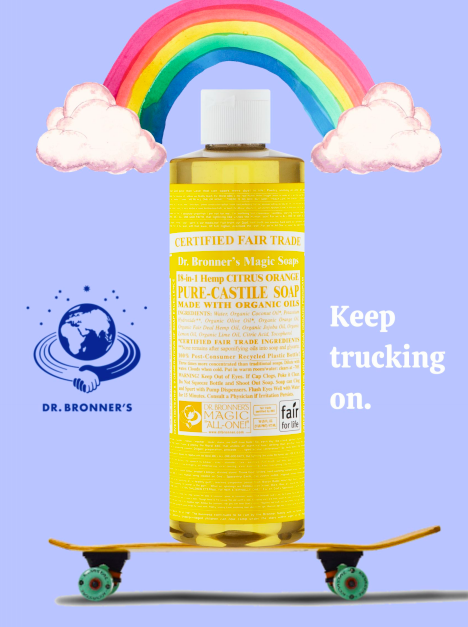
In this class, students were divided into groups of three: writer, art director, and project manager. It was our job to choose a popular brand we knew that was lacking in advertising content and to develop a campaign that was appropriate to their audience. My team chose Dr. Bronner’s.
I think part of the reason why Dr. Bronner’s soap bottles stand out in the store is because of their “terrible branding.” If you’ve ever seen a bottle, you’ll know that the branding on the bottle is essentially a bunch of tiny, encouraging, hard to read words; the only thing that is really legible is the large bold letters on every bottle which read, “Pure Castille Soap.” And while it truly may seem like silly, ugly branding at first, it stands out in a store for a reason, and I think it’s actually pretty brilliant. It’s the soap of my generation, my parent’s, and my grandparent’s generation (in fact, the soap has been around since 1858. So great, great grandparents). It is a product whose function speaks for itself; they don’t neccesarily need to focus on advertising, which is very rare nowadays. Pure Castille Soap, 18 different uses. Cut and dry, a product which does its job, and a perfect candidate for a retro advertising campaign, emphasizing the minty-fresh clean feeling that is oh-so familiar to anyone who has washed with Dr. Bronners.


